In 2013, a Google survey confirmed that 96% of people looking for legal advice used a search engine for guidance. Fast-forward more than 10 years, and the percentage today is likely even higher.
That means a law firm must have an online presence to grow and gain new clients. While there are other ways to establish a firm online, none is better than a website—where you can optimize the content and design to reflect your firm's unique identity and expertise.
Schedule a demo to see what LawPay can offer your firm.
Book Now
Use this guide to design a law firm website that engages prospects and converts them into new clients. You'll learn what good design can achieve as well as the best practices that contribute to an effective law firm website.
Unfortunately, poor law firm website designs can also lead to ethical violations, as discussed in the next section.
Are There Any Legal Considerations When Designing a Lawyer Website?
The American Bar Association (ABA) has published several guidelines that pertain to law firm web design. Key rules and opinions to understand are highlighted below.
Rule 5.5 Unauthorized Practice of Law and Formal Opinion 495
Rule 5.5 addresses issues related to lawyers practicing in multiple jurisdictions or in jurisdictions where they are not licensed. Formal Opinion 495 describes conditions under which lawyers can practice remotely.
The key takeaway for both guidelines is to define the firm's legal jurisdiction clearly. Your website should at least describe the state in which the team is licensed and the state or region in which the firm takes cases.
Rule 7.1 Communications Concerning a Lawyer's Services
Rule 7.1 succinctly prohibits lawyers from making false or misleading statements about themselves or their services. A website that materially misrepresents a lawyer's background, qualifications, or areas of specialty would be in violation.
Rule 7.2 Communications Concerning a Lawyer's Services: Specific Rules
There are two components of Rule 7.2 that apply to law firm websites. The first explains that a lawyer is not allowed to imply specialization in a certain field of law without requisite certification, authorization, or accreditation in that field.
Two, lawyers cannot compensate anyone for recommendations or referrals. There are a few exceptions outlined in the rule, but client testimonials is not one of them. That means it's best to avoid compensating clients with gifts, money or free services to write testimonials for publication on your website or elsewhere.
The Federal Trade Commission (FTC) has also established rules pertaining to the use of client testimonials online. They include:
Companies are required to publish all reviews, not just positive ones. In a related point, the attorney website design should not highlight the positive reviews more prominently than the negative ones.
If the reviewer has a material connection to the business or received compensation for the review, it must be disclosed.
It's best practice to describe how the firm collects, processes, and displays reviews and testimonials.
Additional best practices include getting written permission from clients before publishing their testimonials and specifying that experiences described in testimonials may be atypical.
Formal Opinion 498
Formal Opinion 498 addresses issues of communication, diligence, and confidentiality that can arise from lawyers working remotely. The theme of the opinion is that working remotely is not an excuse or opportunity to deviate from ABA's Model Rules of Professional Conduct—even if technological ignorance or failure comes into play.
If the firm uses its website to deliver client communications or invoices, that website must maintain the highest level of security to discourage cybersecurity attacks and keep client information confidential.
Why Does Your Law Firm's Website Design Matter?
The two main components of a website are content and design. Content is the text, images, and videos published on a website. Design is the site's overall layout and organization. These elements work together to attract potential clients, showcase your firm's expertise, support the website's position in search engine results, and convert prospects into clients.
Effective design, specifically, contributes to:
Visitors finding the information they need quickly and without frustration
Visitors having a good experience on the website, which leaves them with a good impression about the firm
Visitors engaging with the content and staying on the site longer, which is likely a search ranking factor
Visitors choosing to inquire with your firm about legal representation
Existing clients finding information, bill payment options, or other account features easily
In short, a good attorney website design attracts and retains new clients. Poor website designs creates negative impressions and can repel new business.
Law Firm Website Design Best Practices
Keeping those rules and guidelines in mind, it's time to begin the process of creating an intuitive lawyer website design. The seven best practices below will get you moving in the right direction.
Conceptualize Your Site
As a first step, outline your site's content and main features. When doing so, consider your target audience—that is, your ideal client. Think about that client's pressing needs and concerns at different stages. For example:
What information would prospective clients need in the early research of a legal issue?
If a prospective client were considering retaining your firm, what information would sway them to reach out? What factors might prompt them to look elsewhere?
How do existing clients want to use the firm's website? Are there specific features they expect?
If you don't know the answers here, try interviewing or surveying existing clients to learn more. It'll be worth the effort. A lawyer website design that aligns with client needs drives new business and positive client experiences.
Basic features to consider for your law firm website include calls to action, contact information, lawyer bios, a detailed description of your practice area, and a client communications hub.
Calls to action are phrases that direct the website visitor to do something. On the firm's website, for example, you might encourage people to call or complete a form. Note that there are external applications that provide contact as well as intake forms for lawyer websites. MyCase, for example, offers client intake forms that are easily embedded on a webpage.
Accurate contact information should appear on every page. If prospective or existing clients search for your phone number, you want them to find it easily.
Lawyer bios should be friendly and genuine. They should list professional qualifications and accomplishments along with some personal information. Including a photo is also best practice.
A good description of your practice area can win business. Consider highlighting successes (without divulging client details) and explaining why you're passionate about what you do.
An integrated client portal keeps communications clearly linked to a client's case file. For an option that is easy to implement, see the secure client portal included with MyCase's case management platform.
Choosing Your Host
Once you organize your thoughts around content and features, it's time to get technical. You'll need to choose a web host and a domain name. Many hosts support domain name registration, so you could complete these two tasks through the same vendor if you prefer.
The following four items should be primary considerations when choosing a hosting provider.
Uptime performance: You want your website to be functional around the clock. Ask prospective hosts if they have a minimum guaranteed uptime.
24/7 support: Ideally, the host should provide chat or phone support at all times.
WordPress hosting: WordPress is the web's most popular content management system. In this context, a content management system is an application that supports the creation, publication, and organization of webpages. Wordpress is used and loved by both agencies and DIY website builders. Find a host that offers one-click WordPress installation.
Free SSL certificates: SSL certificates enable an encrypted connection between the web server and the visitor's web browser. Many hosts offer free, one-click SSL installation.
Other nice-to-have features include:
Daily website backups
A staging environment where you can build the site before pushing it live.
Optimize for Mobile
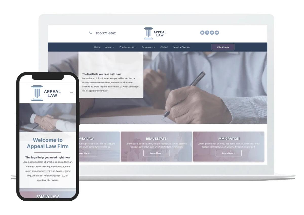
Mobile-responsive design is the default approach for websites today. A mobile-responsive website has one design that adjusts for different screen sizes, including desktops, laptops, tablets, and smartphones.
If you use a free or paid WordPress template to build the site, verify that it's mobile-responsive. Most of them are. If you pay an agency to build a custom law firm website design, make sure the contract and scope of work specify that the finished project will be mobile-responsive.
As an added note, Google Search primarily uses a website's mobile version to determine how and when it appears in search results. A website that doesn't display well on a mobile device may get limited traffic from Google as a result.
MyCase offers customizable website designs as an add-on to its case management solution. The websites are mobile-responsive, SEO-friendly, and seamlessly integrated with the MyCase case management system.

Make It Accessible
An accessible law firm web design can be used and enjoyed by everyone, including those with disabilities. There are many components to accessibility, including:
Using sufficient contrast to differentiate links from unlinked text
Ensuring the website can be navigated with a keyboard and not just a mouse
Adding labels to form fields
Using alt tags to describe images
Form field labels and alt tags are two features screen readers rely on to describe web pages to people with visual impairments.
Prioritize User Experience
User experience (UX) is a broad discipline that emphasizes ease-of-use. UX principles are applied to all types of products but are particularly relevant to digital applications, including websites.
An easy-to-use website is intuitive and understandable. In practice, this means user actions align seamlessly with expectations. For example, if a website user taps on a button that reads, "client testimonials," a page containing client testimonials should load immediately. If the website navigates back to the homepage or displays an error, there is a mismatch between expectation and result. That creates a negative user experience.
The most reliable way to prioritize UX is to ask people to complete tasks on the website and record their actions and reactions. You can even do this informally before the website is built by using hand sketches on paper to represent web pages.
Add Online Payment Options
A legal website can do more than market the firm's services to new clients. It can also streamline the legal process for existing clients. One feature that benefits clients and the firm is online payment functionality.
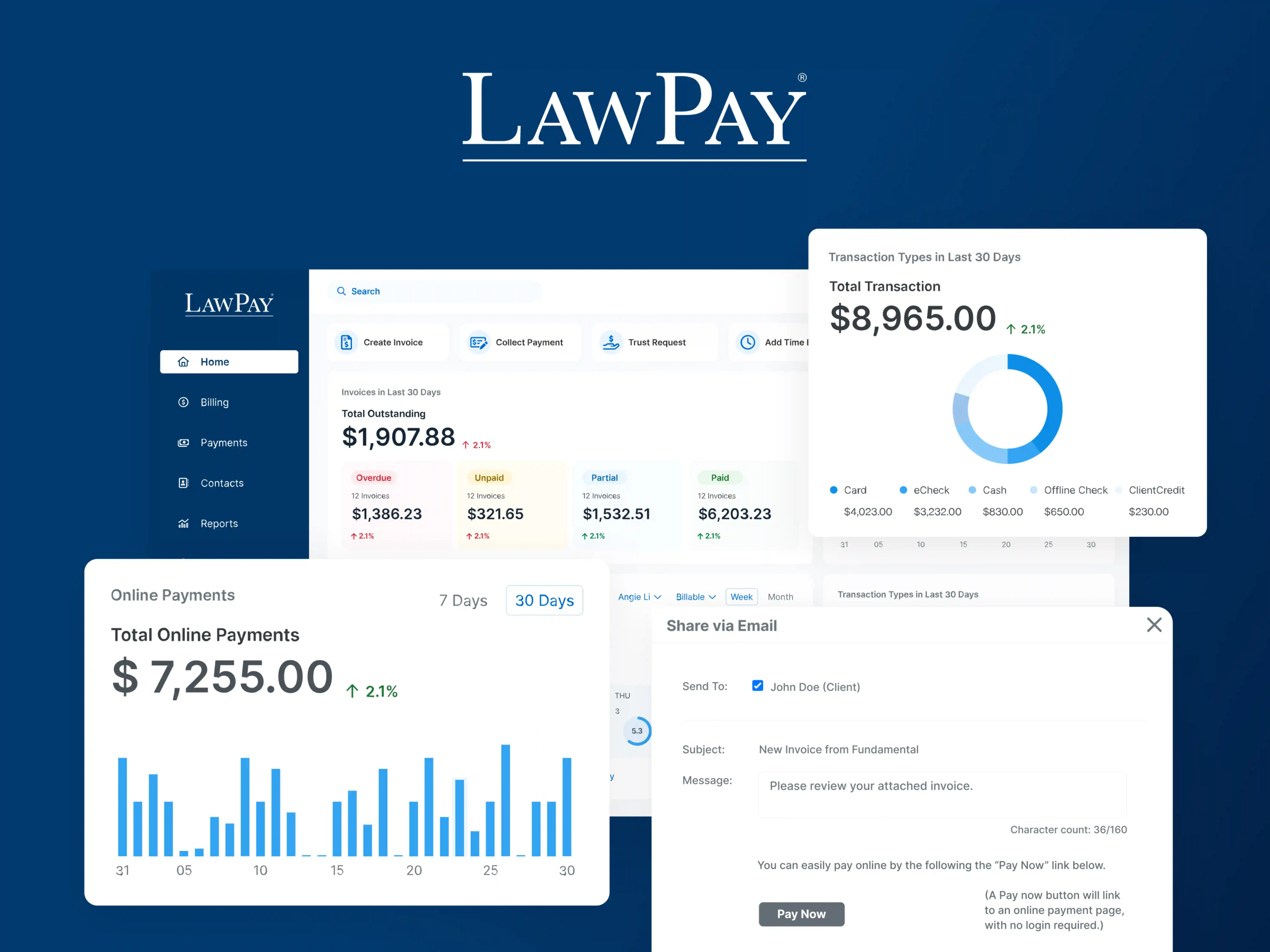
A secure and compliant online payment application like LawPay gives clients easy ways to pay while expediting payments and creating back-office efficiencies. LawPay accepts payments in various forms, including credit cards, eChecks, scheduled payments, and legal fee financing. And because the software is designed specifically for lawyers, all payments and refunds are handled in compliance with IOLTA and ABA guidelines.
LawPay additionally offers integrated time and expense tracking plus invoicing for even greater efficiencies.
You can give clients easy access to LawPay's secure payment pages by adding a link to the firm's website.

Monitor and Improve Web Design
Website development for your law firm is an ongoing effort. Websites are never done; they can always benefit from improvements that will drive more traffic, client leads, and positive user experiences.
A good analytics application collects the data you need to monitor your website's performance and identify potential improvements. The default choice is Google Analytics, which is free.
It's also smart to install a heatmapping and session recording tool for more data. A heatmap is a visualization of how users interact with a web page in aggregate. The map highlights areas of the page where users tap, scroll, or hover their cursor. A heatmap might show you, for example, that most users only scroll halfway down a page. In that case, you'd want to place the most important information on that page above the halfway point.
Session recordings capture an individual's actions on a website, including clicks, scrolls, and movement from one page to another. These recordings document how visitors browse the website as a whole.
Microsoft Clarity is a free heatmapping and session-recording application.
Is SEO Important for Law Firm Website Design?
Search engine optimization (SEO) is the process of optimizing a website, so it gets more traffic from search engines like Google, Yahoo, and Bing.
In today's digital world, the website's design must support the SEO strategy. If it doesn't, the website will struggle to generate traffic without paid advertising.
Before finalizing your website, consider how you will approach SEO and what that means for site design. For example, say your SEO strategy involves publishing a weekly article covering frequently asked legal questions. In that case, your site probably needs a blog. Without it, the navigation and site organization will quickly become unmanageable.
Should You Hire a Law Firm Web Designer?
If some of the points above sound like a foreign language, you might consider hiring a law firm web designer rather than doing it yourself. Key considerations here include:
Your budget. Website development for a law firm can cost between $2,000 and $9,000 if you use an agency or professional designer. You could also build your own website using a purchased WordPress template for $100 or less.
Your comfort level with technology. You can learn the basics of website building, but only if you're comfortable with technology. If not, it's better to hire someone.
Your time. Designing your own site takes time. You may find your time is better-spent networking, marketing, or doing client work.
If you decide to have someone else build the website, ask family, friends, and other attorneys for recommendations.
Schedule a demo to see what LawPay can offer your firm.
Book Now
Final Notes
A customer-centric and accessible law firm website design generates new business and contributes to your firm's growth over time. Take the time to consider the features prospects and clients expect to see on your firm's website. At a minimum, look to include engaging content, inviting lawyer bios with photos, a description of the firm's service area and specialty, client intake forms, a communication portal, and online bill payment options.
MyCase-designed websites, integrated with LawPay, include all these features. You can also easily integrate MyCase intake forms and secure client portal, plus LawPay online payments, into your own website design. To learn more about MyCase and the enhancements it offers to the firm's website, schedule a demo. To see firsthand how LawPay works, schedule a demo here.
About the author

The LawPay Team
